Monday, 28 February 2011

Early Stages of Double Page Spread Designing

I have been given a new deadline; to design and create a double page spread feature for my music magazine in the next fortnight. Based on this, I have begun the basic designing by opening a double page spread (2 A4 pages) in InDesign. Using the skills from my front cover, I used a similar top rectangle section with slanted edges to create a banner for the top of the page. This will house the main headline and tag line to go alongside it.
Using the image I edited earlier on in the project, I have been able to centre the theme of the article around Bon Jovi, a band I am a fan of and know a lot about, and also a band that have been in the music media spot light recently. I have created a fictitious story for the article, as it will take the form of an exclusive interview with the band members and new details about their supposed up-and-coming tour. I have drafted the article and will add it shortly to the page spread.

Front Cover Progressions


After looking more closely at the fine details of my magazine front cover, I decided to edit it further, using a new technique I have recently been taught and learnt. I used the original header rectangle in order to create a more edgy and visually effective banner for the top of the page, to hold the main cover-line and magazine name and issue date.
I also filled up some negative space on the page by splitting up the central cover line into two smaller cover-lines. I used text drop shadowing to draw attention to it and make it look more visually effective. As I was pleased with the outcome of this effect, I also used it on the central cover line. I think that the cover is now close to being finished, however there are still some minor things to edit to create the most visually dynamic cover that I can. 

Contents Page Progression

 I started by editing the layout and text mostly, I then asked for feedback on it, to give me some things to edit and work on further.

After receiving feedback on a printed draft copy of my contents page, I was able to take on board the ideas given to me and dramatically improve the aesthetics and layout of the page as a whole. 

First of all, I paid attention to the negative space on the page, and decided to fill it with images with a red background to make them stand out and relate to the front cover image. I used the strict 3-colour scheme as a continuation of the image, creating an identity for the magazine and it's name.

Alignment of the text with their corresponding page numbers was an issue raised, and due to this, I was able to use the 'character' side bar on InDesign to adjust the height and positioning of the typography, in order to make the lines parallel, creating a more dynamic visual effect. I also added a few more coverlines and page descriptions to create a more complete contents page. 

Saturday, 26 February 2011

Double Page Spread Inspiration

Here I have collected some existing examples of double page spread articles and layouts from various new music magazines such as NME, Kerrang and Mojo. By looking at the content and layout of these articles, I can gain inspiration for my own double page spread, which I will start work on shortly. I have been able to draw up a rough flat plan sketch of a double page spread layout as it stands, which then enables me to draft write the article.
Here are the images of the existing page spreads:
Kerrang Magazine - I really like the layout, use of typography and the use of images on this page spread. I think it looks visually dynamic and I think this will provide the most inspiration for my own double page spread.

NME Magazine - This double page spread is very vibrant visually, which suits the nature of the target audience and also holds their reading attention. I like the use of bold font types through out the spread and I also like the way that the text columns are used to fit around the images and appear not too much writing, so that the target audience will be more likely to read a shorter article which holds their interest. Also, I think the side banner section on the right is effective, as it has different content to the main article, keeping up interest and content of the page.

NME Magazine - This example is also taken from NME magazine, and I really like the use of oversized typography to create the article title and main focus of the page. The use of an orange colour scheme also works well as it is vibrant, eye-catching and stands out from the rest of the content in particular. There is a lengthy amount of text on this spread, which I would avoid. The use of one full page image is also effective, however I may not use this element, as I would like the content to be a bit more inventive.

Wednesday, 16 February 2011

Contents Page Work

Following the previous basic work on the layout and content of the Contents Page, I have been able to progress the work further and create an almost finished copy of it.
The layout I have used mirrors the image of the front cover, which is an effective tool I have found from research and it is popular with modern existing music magazines, so I have decided to utilize this in my work. I have incorporated the colour scheme into the contents page also, using a gradient scale black and white filter to create a background.

I have also used tag lines and cover lines at an angle to create a more visually interesting contents page. As the page is progressing, I am also adding some images that I have edited from previous stages in the creation process. There is still some more work to be done on the contents page, however here are some screen shots of the page as it stands:

1 -Working on the layout

2 - Adding more cover and tag lines


3 - Adding Images
4 - Adding more coverlines and changing layout

Front Cover Progressions

Using the image I have now just edited, I have used the existing image and layout I had planned and mapped out for the front cover and re-worked it around the focus of the new image, using the same features, just in different positions and at different angles. Using the same typeface for the most part of the front cover looks visually effective as it creates corporate image and continuity. I discovered this particular font in the Preliminary task and as I found it to be visually effective and suit the music genre, I decided to use it in this piece of work also. Using the angles in the picture, for example the angle at which Connie is holding the guitar, to create angles and paths/lines for the cover line text to follow. For example, for the central cover line, I used the angle of the fret board on the guitar to create an interesting visual dynamic.


This cover isn't finished as of yet, there is still more work to be done, but here are some current progressive screen shots of the work in progress: 


Monday, 14 February 2011

Photoshop Progressions

After choosing the most appropriate and visually effective photo out of all the ones I had taken of Connie posing, I decided to develop and edit the photo, to make it suit the existing image of my front cover layout and design. First of all, I used the 'sharpen' tool to create a more crisp-looking image. I then used the auto-brightness tool to adjust the light exposure and make it look more modern. After looking at the arrangement of the text I wanted for my front cover, I then used the 'flip horizontal' adjustment to turn the picture around, so that Connie was facing the other way, to fit better with the layout. I hadn't used this tool before and found it to be really useful.

In order to blank out the background parts, like the plug socket on the wall, the door and the skirting boards, I used a technique I was shown, which was to use the colour-dropper tool to pick out the main overall grey-ish scale background colour. It was then added to the palette, so I could used a wide brush tool to edit out the background parts I didn't want to be seen. I found this effect really successful, and I am pleased with the results.
Using the crop tool afterwards, I managed to cut out parts of the photo that were just acting as negative space that wasn't needed. The final adjustment I made was using the 'Render' tool, to add a 'lens flare' to the picture, creating a modern, photographic effect.

Here are some screen shots of the editing process of the chosen final photo:

Before and after the horizontal flip of the image.

The Final Progression

Friday, 11 February 2011

More of the Photos

Here are some more of the photographs that may be possibilities for my magazine front cover:


New Photoshoot Photographs


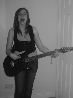
After planning to take another set of photographs, I decided to use my friend as a model for my new photos. I asked her to dress like a young, modern and up and coming music star of today. So based on this criteria, I helped her choose her outfit and then we used a guitar to make the picture instantly authentic and musical. She is naturally a singer, so I decided to take some pictures of her singing and miming playing the guitar. I took a range of pictures, using many different light modes on my camera, and also adjusted the colour settings so that some of the photos were taken in sepia and black and white. I am pleased with these pictures and after some editing, I think they will be more suitable for my magazine cover than the previous pictures I had taken. Below are some of the photos I took. I will decide next lesson which photo will be the best for my front cover once I have experimented with editing on Photoshop and InDesign.

Monday, 7 February 2011

Initial Contents Page Creation

By looking at the design of my magazine's front cover, I have been able to create a basic layout and image for my contents page. I used the same background and similar typography to continue the corporate image I have created for my magazine. By using inspiration from existing music magazines such as NME and Q, I have been able to create my own style of contents page, minus the images, to give information to readers about what they can find in the issue at the time. Below is a screen shot of the progression of the unfinished contents page as it stands. I am pleased with the image of it so far, as I have used a gradient coloured background to create a unique appearance and I've also used angled text to create a more interesting layout.


Dramatic Changes To Magazine Cover

After receiving informed feedback on a rough draft of my magazine cover, I have decided to make dramatic changes to it as I wasn't happy at all with the visual image my magazine cover and the front image quality was also poor. As a result of this, I was able to rework the layout and typography of the front cover, by removing the image and then using various InDesign features to create a basic layout. The screen shot below shows the layout of the front cover as it stands, with the improvements made. For example, I was advised by my teacher to increase the size of the title logo, in order to make it a more prominent focus point of the magazine cover. Also, using the colour scheme of the title logo, I was able to create an ongoing black, red and white theme across the cover and onto the corresponding contents page. Due to these decisions to change the magazine's cover photo, I will be shortly carrying out a photo-shoot with one of my friends who is a singer and guitarist, and then I'll edit one of those photos to create a more up to date and effective look for my front cover.

Friday, 4 February 2011

Experimenting with Image Editing Software

In order to widen my knowledge and use of a range of different image editing programs, I have used an online editing site called www.picnik.com - It allows you to upload a photo, edit it in simple ways, such as adjusting the contrast and sharpening the image, and then save it for your own further use. Using this site, I decided to experiment with my front page photo and here is a screen grab of the result:


The quality of the image is not that much different, however I have made some improvements on it, in terms of lighting saturation and size of image. The warmth and depth of the lighting creates a more contemporary image atmosphere and I may consider this style of photo editing when it comes to choosing the final edited photo to go onto the front cover.