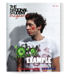
In order to gain some useful background knowledge about existing Student/college magazines, I have saved some images of the front covers of the magazines, and I have analysed them. This has helped me gain some inspiration for my magazine, in terms of cover lines, mastheads, images and layouts.
Right, the 'Student Magazine' front cover. Looking at this cover, I can take some useful inspiration from it. For example, I like the layout of the cover lines, it sticks to the idea of the cover being split into thirds, with the central mid-shot image being central and the cover lines scattered left and right. The font used for the masthead is emphasised by being white in colour and is placed in the foreground, on top of the image. The sans serif font is also effective, as it is the stereotypical font associated with American College varsity and student life in general. I may consider this font for my designs, as it is impacting and effective. In terms of colour, this cover uses two bold and impacting colours of red and green, bringing the clothes from the picture to tie in with the font and 'St Patrick's Day' theme. This is an effective professional tool. I can see how it appeals to a teenage audience, as it is vibrant and the cover lines would interest them, for example, 'what to do when you're 20' as this is relevant to them. The model used for the photo looks a little old to be a college student and I don't like the pose, however, it suits this particular cover.
Left, The National Student Magazine cover. This cover has a more simplistic layout, which is effective as it draws attention with a white background, placing emphasis on the image. I personally don't like the lack of cover lines, as it doesn't make the magazine issue seem that interesting or exciting. However, I like the use of two different contrasting fonts and colours for the masthead. This is effectively eye catching. I also like the use of image editing, which I plan to use on my central image, along with the use of shadowing, like in this picture.
The use of graphic design is effective with the bottom central cover line also. I intend to experiment with different fonts for my cover lines too, as it draws attention and gives the cover depth.
After researching this covers, I can see stark differences and I will use this background knowledge as design inspiration.


No comments:
Post a Comment